

Rexpand Mobile App Redesign
Driving a 40% Decrease in Job Posting Dropout Rates
Rexpand, a mobile app connecting referrers with job seekers, faced high user dropout rates during job posting. This affected both referrers posting opportunities and job seekers accessing them, resulting in decreased user engagement and hampering the company's membership growth. The redesign had to be designed and launched in three sprints.
ROLE
Lead product designer
TIMELINE
Sep. 2022 - Oct. 2022
DELIVERABLES
Strategy, User research report, Information architecture, User flows, Wireframes, High fidelity UI, Prototypes, Final specs

User dropout rates during job posting 20% above target
Job opportunity posting is a crucial process within our app. Currently, the 60% dropout rate significantly impedes our ability to attract and retain job seekers, our subscribed users, directly impacting app growth. The goal is to reduce the dropout rate to 40%.

Having identified the top dropout point in collaboration with a data engineer, I'm set to conduct user research for further insights.
Challenges faced by users: confusing referral options, extensive form length, and time-consuming data entry.
To understand user pain points, I conducted usability testing and interviews with 10 participants on the existing opportunity posting flow. I then synthesized the findings.
“Seeing the long list of details I had to fill in made me think, ‘This is overwhelming, shall I continue?’”
- User testing participant #2
To address the uncovered insights, I decided to improve clarity, streamline the process, and enhance efficiency.
Compiling user feedback and distilling design directions
I facilitated design sessions with key stakeholders to explore design options addressing the identified pain points.
For example, to simplify the process, we had two options: one with a stepper and the other showing a percentage of completion. To enhance efficiency, we introduced two methods for auto-suggesting skills that users can choose from.
I then conducted usability test and interviewed 8 participants.

Learning from user reactions to different options guides me to iterate the design or confirms its effectiveness.
Where we landed

Clarity on referral types
When users select the referral type, the added info icon helps them distinguish between the two referral types.

Guided information entry
To reduce user overwhelm, data fields were reorganized into manageable sections guided by a stepper.

Effortless job title input
To enhance efficiency, autocomplete was introduced for quick job title entry.
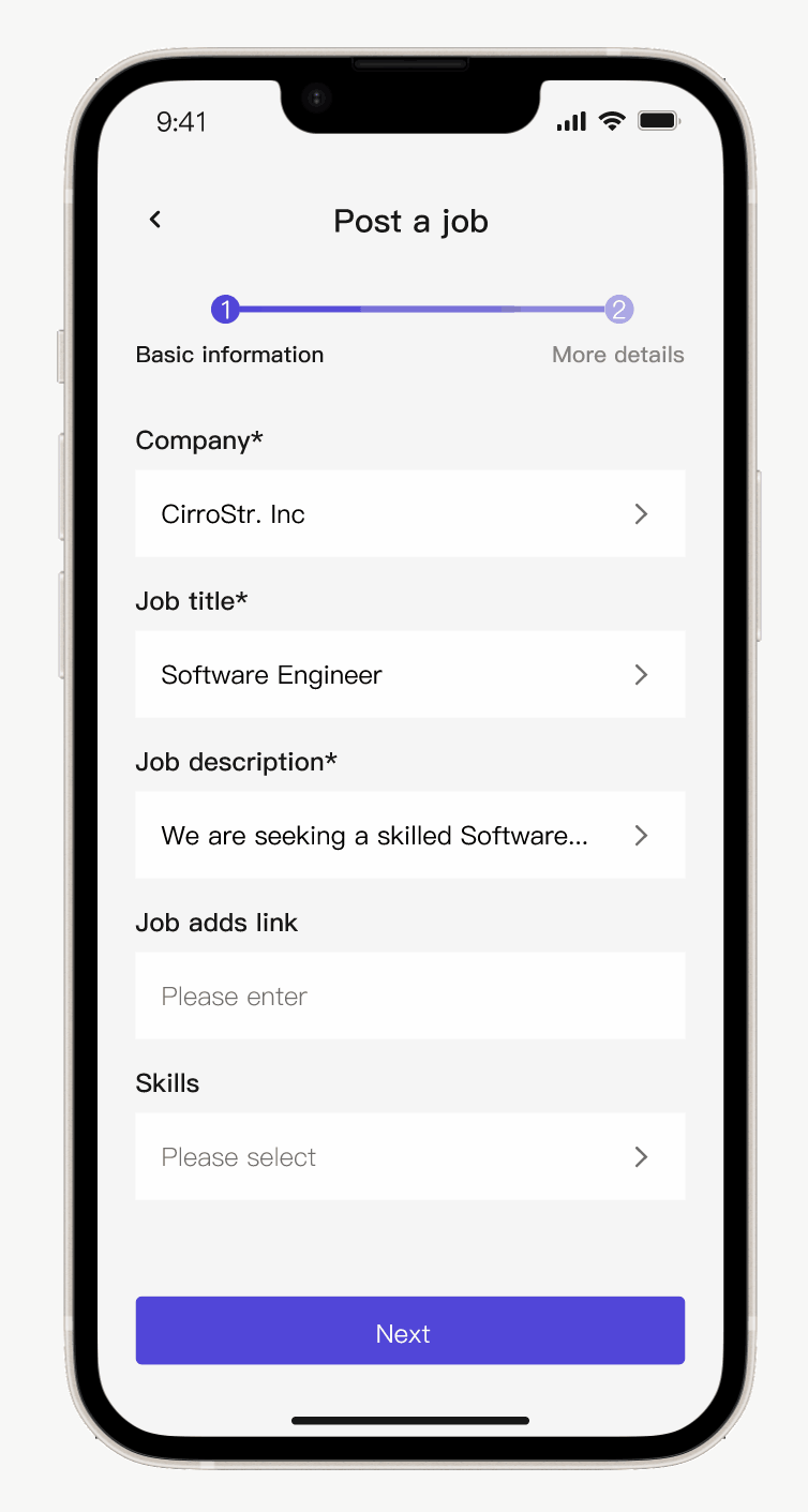
Facilitating skill selection
Compared to manually entering skills before, we now provide relevant skill suggestions for easy selection.
Enhancing user awareness and engagement post launch
After one week post-launch, we noticed a reduction in the user dropout rate within the job posting flow. However, we also observed a lack of engagement with the “Post Job” button. My hypothesis is that users were not aware of the redesigned feature. To address this, I added a redesign announcement modal. Following that, we observed increased user engagement and a further decrease in the dropout rate.
After 3 months post-launch, the user dropout rate was reduced by 40%.

Implementing a modal to introduce the redesigned feature; the modal appears when the user opens the app. Once a user closes it, the modal won't reappear.
Next steps and key learnings
Looking ahead, our plan involves automating the process by implementing features that auto-populate job descriptions when users provide job opportunity links. Additionally, we will explore using generative AI to automate job description generation.
A key lesson I've learned is that enhancing user awareness is crucial for improving engagement and feature interaction.